Hey guys, sorry it's been so long since I posted anything. Don't fear though, I'm back.
I have completed a creative brief for Sin and I figured I would share it.
Client Company:
Sin Energy
Project Description:
A logo and packaging
for Sin Energy.
Background on Client/ Brand Image (How this
new image assist them):
A logo will help in
marketing Sin Energy as well as helping them to develop their brand. Packaging
will also help their brand image by making them stand out from their
competition.
Client Materials: Request logo, promotional
material, advertising, collateral material, etc.
Logo and packaging.
What is the service the client’s organization
provides to the company?
The
client makes energy drinks. The overall image that they want to project is
wicked and dark. They have also themed their drinks around the seven deadly
sins. The client feels that their selection of energy drinks are a safer alternative
to what is currently on the market. They believe this because they make their
drinks with all natural ingredients. Since the company is new, they haven’t
released any of their drinks to the public yet but they have secured places to
sell their product in a major chain of convenience stores.
Who is the primary target market?
Their
primary target market are people within the 15-25 age range that drink energy
drinks frequently. (Mainly Males)
What is the nature of the problem(s) to be
solved or need to be met/ company needs?
The
company doesn’t have an official logo. Sin Energy needs both a logo and a
package design to help build their brand.
How has the problem been solved or need been
met in the past?
Since
Sin Energy is a budding company, they are starting with a clean slate. Therefore, the problem has yet to be
solved.
Describe the competition. What are the
strengths and weaknesses of your organization as compared to similar
organizations?
The competition
would be other energy drink companies such as:
·
Monster
·
Red Bull
·
Rockstar
·
Nos
·
Scheckter’s
(organic)
·
Hype
(organic)
·
Opta
Energy (organic)
Strengths:
· Unique
· Dark
· Quality Product
· Different flavors for every taste bud.
Weaknesses:
·
No
official logo
·
No
official packaging
·
Brand new
How are the organization’s services different
from what the competition offers?
The
client’s product offers a better alternative to normal energy drinks that is
safer due to the use of all natural ingredients. Only natural sources of energy
are used to create the product. They also offer many different varieties of
their energy drinks that will suit every customer.
What is the single most important message that
you wish the reader to remember about this service or program?
People
should be able to recognize Sin Energy by its package as soon as they see it.
They should also be able to easily identify Sin Energy’s logo. Both of these
things should bring out the best of the company and should help Sin Energy
expand their business through branding.
What is the key appeal of the message
(emotional, narrative, endorsement, recognition, or lifestyle)?
The
key appeal is mainly recognition. As stated before, people need to recognize Sin
Energy as a brand. People need to understand who they are, what they offer and
what they stand for.
Why are people interested in the service or
program offered?
·
Quality
product
·
Unique to
the market
·
Healthier
alternative
Are there additional key points to be included in the
message? (Also intended mark design direction.)
·
Sin
(Energy)
·
Dark
Colors
·
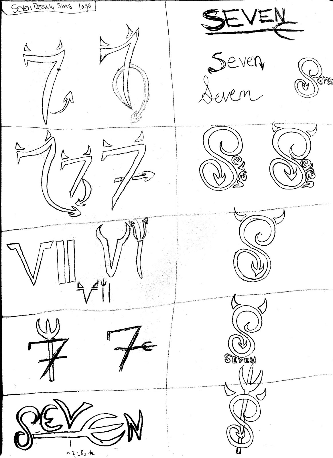
Seven
Deadly Sins (drink is based upon this)
·
Unique
package
Are there special things to keep in mind, such
as legal requirements, technical, or graphic requirements (specific colors,
size, quantity, logos to be included, etc.)?
Stick
with a dark and wicked theme as well as dark colors. Package must stand out
from the crowd.